2023 Winner


SilverNiche Strategy
IKEA
"Window Shopping"
Rethink
"Window Shopping"
Rethink
CASE SUMMARY
For decades, city-dwellers have had to venture outside of the downtown core to get to IKEA. After years without a downtown presence, IKEA was at risk of being seen as a suburban brand catering only to suburban people, losing share to more accessible brands located downtown.As the brand launched a new IKEA store in downtown Toronto, they needed to powerfully demonstrate that their new outlet was designed with downtown living in mind. And as the cost of living has gone up around the world, downtown living has come to mean paying more money for less space. They needed to show how IKEA can make small space living easier and more affordable, while authentically connecting with a new audience in the downtown core.
The best way to understand downtown living is by living downtown.
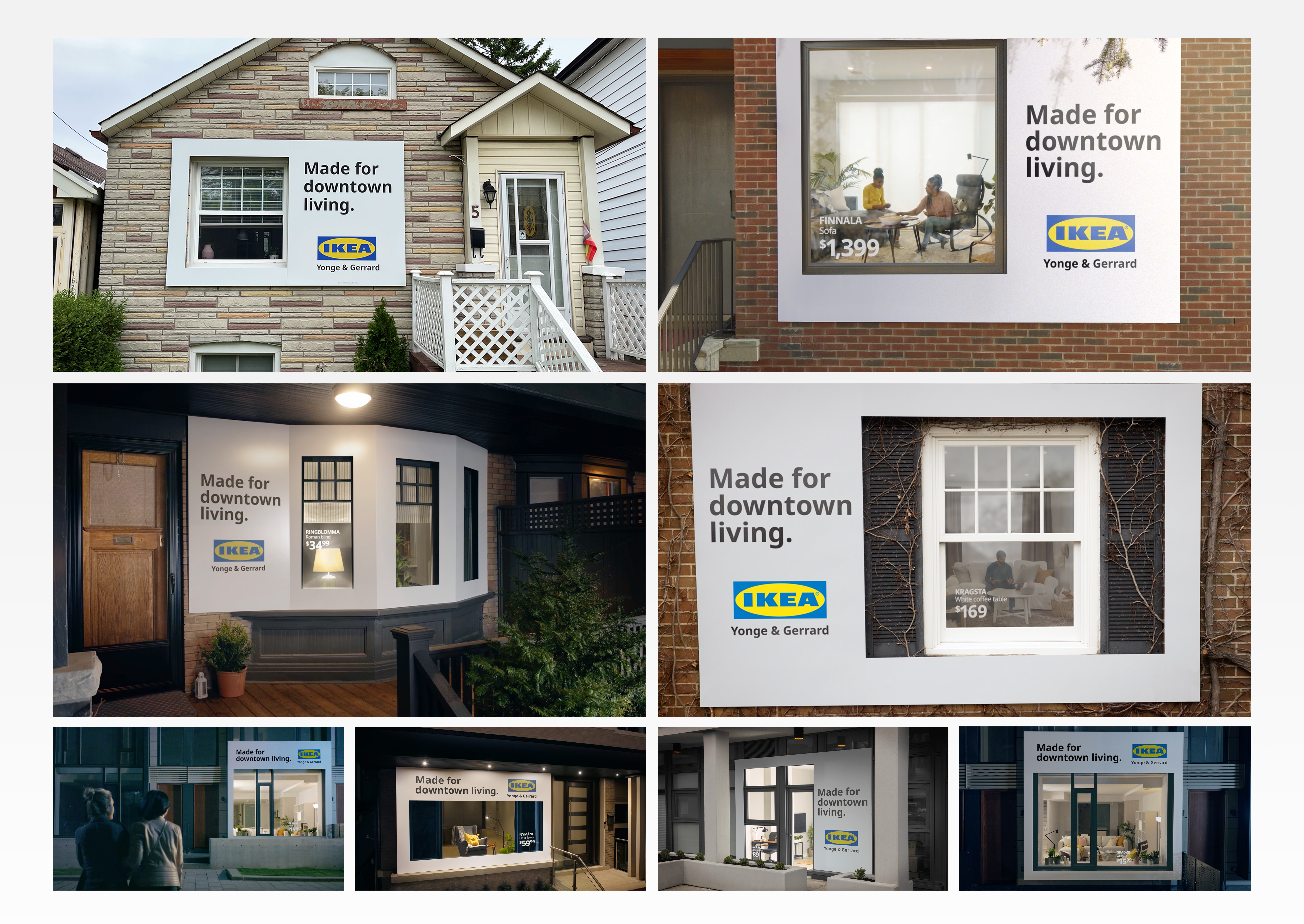
Use real-life homes to show how IKEA is made for Downtown living. The plan: To grab attention from an always-busy big city media landscape, and prove to Torontonians that IKEA’s downtown store was truly “made for downtown living,” they created living ads out of the city itself—using real homes (with real people in them!) and turning them into instantly recognizable IKEA “billboards.”
Unlike a traditional installation or advertisement, utilizing real homes with real people enabled IKEA to highlight a wide breadth of people and living spaces—especially small-space living—representing and celebrating the diversity of life in Toronto. They turned the exteriors of real homes into out-of-home ads by replacing product images with actual products inside the house.
In order to replicate the IKEA design system as closely as possible, they matched the “layout” of their living billboards to the iconic IKEA guidelines. Where an image would typically be in a standard out-of-home ad, was a real live scene inside the home. The billboards themselves were affixed to their selected homes, and the windows stickered with the globally-recognized ‘BBP’ (big, black price) calling out individual IKEA products.
The launch campaign garnered 62+ media stories, and 31+ million impressions and made an instant splash in the city. While the campaign was in-market, the new downtown store saw foot traffic 41% higher than the baseline, not to mention the noticeable lines that formed outside the store every day.
In their quarterly brand tracking isolated for Toronto, they saw a +4% in TOM awareness (their key metric), as well as an increase in brand trust by over +1%. Importantly, Toronto consumers feeling inspired by IKEA
lifted by +1%.
Credits
Chief Creative Officer: Aaron StarkmanHead of Art & Creative Director: Joel Holtby
Creative Director / Art Director: Zachary Bautista
Associate Creative Director / Copywriter: : Geoff Baillie
Chief Strategy Officer: Sean McDonald
Strategy Director: Shereen Ladha, Jay Fleming
Group Account Director: Kiara Wilson
Account Director: Megan Christopher
Account Supervisor: Erica Francis
Account Manager: Chaityadeep Singh Mainee
Director of Print Production: AJ Merrick
Senior Integrated Producer: Terri Winter
Production House: Undivided Creative Inc.
Director: Jeremy Thompson
Director of Photography: Jeremy Thompson
Production House Producer: Christa Lindsay
Studio Artist: Brad Kumar, Todd Bennett, Justin Chan, Stephanie Sherwood, Nabil
Editor: Tyler Erdelac
Print House: ProPrint Services
Colour / VFX: Hardave Grewal, Dan Mccarthy
Audio House: Vapor Music
Music Director: Ted Rosnick
Audio Producer: Kailee Nowosad
Casting: Groundglass Casting (hero), Faces and Places Talent Agency (background)
Media: Carat
Account Director: Tracey Cronin
Digital Performance Strategist: Kevin Martins
Client Supervisor: Johanna Andrén, Jordan Sequeira, Brooke Lougheed, Lisa Huie
For submission inquiries, please contact Bianca Sbrocchi at bsbrocchi@brunico.com.
For partnership inquiries, please contact Neil Ewen at newen@brunico.com.
For partnership inquiries, please contact Neil Ewen at newen@brunico.com.
